Could the Guggenheim in New York have been pink? Debunking the white and gray myths of modern architecture
Looking at classical antiquity all the way to the impact of Frank Lloyd Wright and Frank Gehry, architect Adam Nathaniel Furman dismantles the ‘purifying power of white’ that continues to shape our present
This past May, an AI-modified image of the Geisel Library in San Diego led to a humorous architectural meme. Shared on X, it showed the exposed concrete walls of William Pereira’s imposing building (usually categorized as “Brutalist”) painted with garish colors, protective deities and classical Greek motifs. The image was accompanied by a message: “There’s a common misconception that Brutalist buildings were unpainted, but thanks to microscopic analysis of the exteriors we can now recreate what they looked like in their prime.”
There's a common misconception that Brutalist buildings were unpainted, but thanks to microscopic analysis of the exteriors we can now recreate what they looked like in their prime. pic.twitter.com/P2AW49BONS
— Cairo Smith (@cairoasmith) May 1, 2026
Soon, similar “restorations” of other architectural landmarks began circulating online: the Brunel University Lecture Center in London, covered in Renaissance frescoes. Agustín Hernández Navarro’s futuristic studio-house in Mexico City, adorned with feathered serpents and Mayan warriors. And the Statue of Liberty, portrayed as if it were a sculpture of a goddess in a Greek temple (that is, in polychrome: the original statues were painted in bright colors, according to microscopic analyses). But after this avalanche of parodies, the image of another digitally-colored building also went viral… even though this one had no satirical intent.
Posted by British architect Adam Nathaniel Furman, it depicted the Guggenheim Museum in New York City tinted a striking pink, instead of its familiar white. It turns out that pink was precisely the color Frank Lloyd Wright envisioned for this museum in his plans, and it’s the color we would see across the street from Central Park today had prejudices not stood in the way.
In an interview with EL PAÍS, Furman explains that his tweet was a teaser for Chromatic Architecture (2026), a book in which he and his co-author, Kate Mazade, analyze the history of color in architecture. The iconic New York building should have been included in this palette.
“White wasn’t part of Wright’s repertoire; that ‘anti-color’ belonged to European modernism,” he states. “Wright always sought architecture that was in harmony with the geography, climate and landscape of America, supported by a palette born from the land itself: terracotta, intense reds and pinks. So, it makes sense that he envisioned the museum that way. The current white color is an aberration.”
“Solomon Guggenheim wasn’t convinced by Wright’s idea,” Furman continues, “and the New York authorities ended up approving the Le Corbusier-esque white that we see today.”
Released this past September by RIBA Publishing (the publishing arm of the Royal Institute of British Architects), the book was written by Furman in collaboration with journalist Kate Mazade. It maps out some of the buildings that successfully challenged monochromatic design and kept the power of color alive. Among the projects discussed, there’s the Seattle Museum of Pop Culture, a work by Frank Gehry, with steel and aluminum panels in shades of gold, cherry and purple; the hue changes depending on the sunlight. And the colonnade clad in handcrafted tiles — with a gradient ranging from white to blue — that Furman himself designed for London’s East Croydon station.
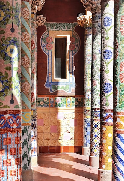
The book also touches on masterpieces of Catalan Modernism, such as the Palau de la Música auditorium in Barcelona, or a more recent example: the Central Library and Municipal Archive of Leganés, about seven miles southwest of Madrid. Designed by BN Asociados Arquitectos, its facade is made of convex ceramic tiles in pastel shades, reminiscent of stacked book spines.
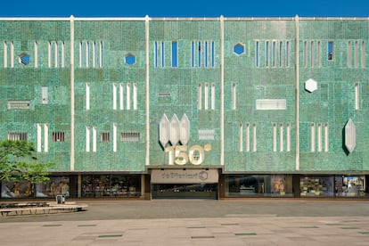
Another marvel is the De Bijenkorf shopping center in Eindhoven, Netherlands, designed by the Italian architect Gio Ponti. Its green-tiled facade is reminiscent of the oldest surviving example of color integrated into a building: the turquoise cladding of the tomb of Pharaoh Djoser (2630-2611 BC), also featured in Chromatic Architecture. The authors identify it as the earliest known expression of a tradition that would later be carried forward by the Babylonians in the Ishtar Gate, as well as by the Greeks, Romans, Byzantines, and the master builders of the Gothic and Renaissance periods.
The myth of a white classical world
Curiously, one of the people most responsible for erasing the vibrant world of color that actually characterized antiquity was also one of the classical world’s most passionate scholars. His name was Johann Joachim Winckelmann (1717-1768). Considered to be the father of art history, he believed, according to the authors of Chromatic Architecture, that the “noble simplicity” of Ancient Greece resided in the stark whiteness of its sculptures and temples.
In his writings, he identified the purity of marble with the rational and the divine, relegating color to something merely “emotional, sensual and distracting.” Those views may seem somewhat paradoxical coming from a man who, as a gay man and an icon for many of today’s queer thinkers and creators, including Furman himself, held what now appears to be a remarkably austere vision of the ancient world.
“It’s ironic, yes, but it also reveals the complexity of queer identity and the concessions that the era demanded to achieve acceptance,” says Furman. “Maybe his theoretical rejection of color was a price to pay: a way of hiding the sensuality of his gaze beneath the appearance of virtuous whiteness.”
From 1811 onward, archeological discoveries demonstrated that both Greece and Rome were completely covered in paint and brightly colored stones. And yet, the obsession with a white antiquity proved so entrenched that, in the 1930s, the Elgin Marbles in the British Museum were even cleaned with copper scrapers and abrasives. This was done to remove microscopic traces of paint and make them conform to that colorless fiction.
“The vision of a pure, perfect and intellectual origin for Western exceptionalism was too powerful to let go of,” Furman continues, during his conversation with EL PAÍS. “Admitting that this image was a lie — that our past was just as colorful as the rest of the world’s and that we weren’t so exceptional — was terrifying. Then, instead of questioning this idea, 20th-century rationalism turned it into dogma, with architects like [Adolf] Loos and Le Corbusier praising the purifying power of white and cementing a deep prejudice that, to this day, still defines what we understand as sophistication in architecture.”
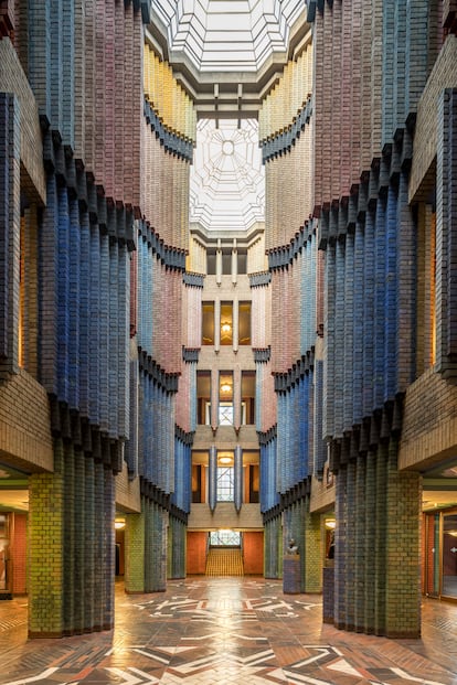
The profession was not entirely blind to this alternative vision. Built in 1924 by Peter Behrens, the Hoechst AG Technical Administration Building in Frankfurt, Germany, is one of the examples that the book uses to demonstrate that, even in the midst of modernity, there were alternatives to this dogma. A landmark of Brick Expressionism, the office complex conceals a 50-foot-long hall where bricks painted in different shades of green, blue, red and yellow bathe the space in an almost mystical light.
Its vibrant interior allows us to imagine what the Monadnock Building — one of Chicago’s oldest and most famous skyscrapers — might have looked like. This was yet another example of where the use of color was censored, much like in the case of Wright’s Guggenheim.
“It’s often cited as a framework of austere rationalism and a prelude to European modernism,” Furman explains, “but, in reality, John Wellborn Root conceived [the Chicago building] as an exquisite cascade of polychrome brick: a canvas that faded from yellow at the top, to a dark purple at street level. Unfortunately, though, the client rejected the idea due to cost and aesthetic reasons. Then, it was conveniently ignored by historians, who ended up using the Monadnock Building as an argument against the very ideas about color that Root had passionately championed.”
The quotations that the authors of Chromatic Architecture intersperse between photographs of the buildings also show that fascination with color was far more widespread among the pioneers of modern architecture than is often assumed.
In 1936, Le Corbusier wrote that, “Polychromy is as powerful an architectural tool as the plan and section.”
For Gio Ponti, “everything in the world must be colorful […] Tradition has always been health, strength, life and therefore color, and it has never worn gray trousers, gray jackets or gray overcoats, which are all things that make gray faces, gray spirits and gray lives. True tradition, the kind I adore, the kind safeguarded by innovators, has always been colourful and sanguine.”
Nevertheless, the anti-color movement ultimately prevailed, reaching what Furman sees as a point of no return with the rise of the Nazis and the outbreak of the Second World War.
“In pre-war Europe, countless visions of the future coexisted — Cubist, Expressionist, Futurist, or Dadaist — in which color was fundamental. Even at the Bauhaus, it was a basic pillar,” says Furman. “And when studying the very master of white, Le Corbusier, you quickly understand that he was a case of ‘do as I say, not as I do,’ because it’s difficult to find an architect who was more enamored with color than he was.”
“However,” says Furman, “when architects fled Europe for the United States, all that diversity was lost. Modern architecture calcified into puritanical dogma that excluded color, erecting a new wall around the already-impregnable, colorless fortress that had been built during the Enlightenment.”
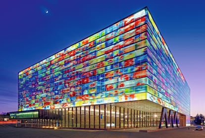
There are exceptions, of course. Buildings like the Anne and Charles Duncan Hall at Rice University, in Houston, designed by British architect John Outram with an explosive display of allegorical columns and multicolored floors. At one point, architecture professors even went so far as to prohibit first-year students from entering, so as not to “corrupt” their delicate minimalist minds. There’s also the Netherlands Institute for Sound and Vision, in the city of Hilversum: the building was designed by Neutelings Riedijk Architects and has a façade made up of thousands of polychrome glass panels, which shine like a giant television screen.
Another notable example is the brand-new Chonburi Multi-Purpose Building in Thailand. Designed in 2024 by Suphasidh Architects, the colors come not from paint, but from the very material that the structure was built with: rammed earth, made of sands, clays and stones from various parts of the country.
Still, despite the beauty of these exceptions, Furman is skeptical: “I don’t see the situation changing. The assumptions and prejudices that have relegated color to the category of a guilty pleasure are so ingrained that the vast majority don’t even recognize them as opinions: they’re accepted as indisputable facts.”
Faced with this hegemony, Furman’s own relationship with architecture has always been an act of visual resistance. EL PAÍS asked him about his origins: “I was lucky enough to grow up in a family with many cultural influences — I was surrounded by women who had a sense of style that didn’t at all follow the prevailing ‘good tastes’ — and to experience the gay scene in 1990s London. All of that gave me a deep appreciation for color.”
“As a teenager, on gray days, I would go to the National Gallery to take refuge in front of [paintings by] Bronzino and Titian. And I was fascinated by Eduardo Paolozzi’s mosaics in the Tottenham Court Road tube station. I was born, raised and educated in a sea of deliciously warm color.”
A haven of color that he now shares with the world through the pages of his book.
Sign up for our weekly newsletter to get more English-language news coverage from EL PAÍS USA Edition