Yellow furniture and decoration: Why not?
Long associated with superstitions and bad omens, the color returns this fall in its freshest and most resounding version. Its use in the home is associated with warmth, joy and light
Oh, were you one of those who thought that yellow was a cursed color, a bad luck color to be avoided at all costs? Well, that’s not true. Some people are so old-fashioned, superstitious and negative, especially now that the urban legend that Moliére died on stage wearing that color has been disproven. Update your perspective this autumn: yellow has arrived as one of the season’s decor trends, and it is fresh, unadulterated, and resounding; there’s no hint of shyness or any intention of hiding.
In his Theory of Colours (1810), the German scholar Goethe discussed the psychological and symbolic aspects of colors at length, including yellow, which he associated with warmth, joy, and light. Russian artist Wasilly Kandinsky explored the emotional and spiritual effects of colors in his book Concerning the Spiritual in Art (1912); he argued that yellow radiates from the center and seems to approach the viewer and move out of the picture in an unsettling way that evokes delirium. Kandinsky associated colors with sounds and believed that yellow represented a trumpet or a bugle.
It is certainly difficult for this color to go unnoticed. In fact, it has traditionally (and effectively) been used on traffic signs to caution drivers; such visual warnings could easily replace a good trumpet blast. Michel Pastoureau, the author of The Colours of Our Memories (2010), says that his first memory of color is that of the yellow vest André Breton wore when he came to visit his father; Pastoureau was only five years old at the time!
Consequently, when applied to an interior, yellow is considered to be a great way to highlight a place, give it importance, draw the eye to it and emphasize that particular spot. On the other hand, the color is also useful in dark areas, since yellow adds luminosity to any location that lacks light.
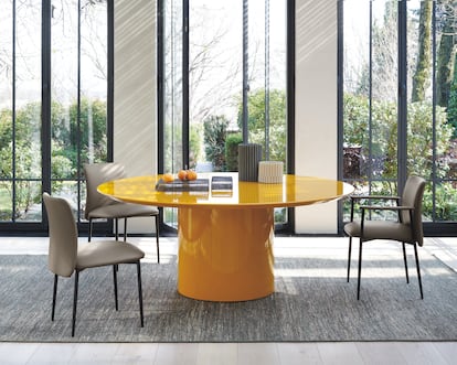
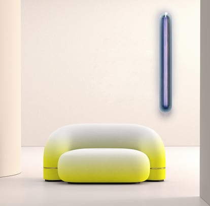
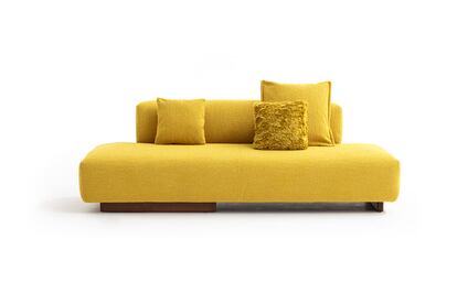
Traditionally, yellow has been used with some trepidation, in small doses, as a little refreshing touch in the form of a decorative object like a vase, a cushion, or a blanket. That was an easy way to not let things get out of hand, to keep everything under control and not take risks. But now it seems that this caution is being thrown to the wind: many of the major furniture brands have opted to use the cheerful and lively yellow in upholstery and lacquering for good-sized pieces, from sofas to dining tables to rugs.

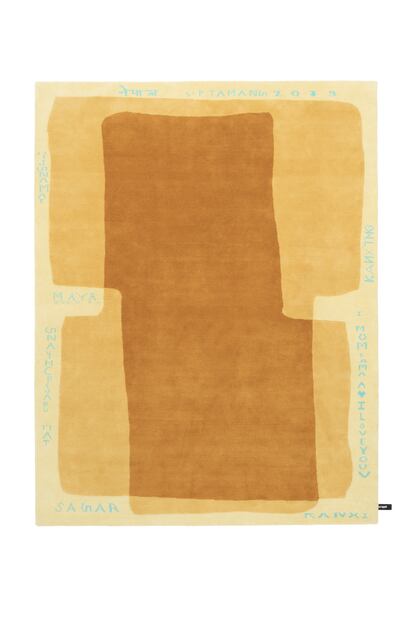
Special mention should be made of three sofas in bold shapes that are reinforced by the choice of yellow: the monolithic Tortello by Barber Osgerby for B&B Italia; the Mr Loveland by Patricia Urquiola for Moroso; and the Bumper by Calvi Brambilla for Zanotta. The Telegram rug, by Formafantasma for CC-tapis, has the unique attribute of displaying words chosen by the artisans themselves as part of its design. And then there are tables like Sorvete by artist Joana Vasconcelos for the Bombom collection designed for Roche Bobois. A wide variety of different chairs also opt for yellow this season, including the stained-wood Zampa chair by Jasper Morrison for Mattiazzi, and the upholstered Romby chair by Gam Fratesi for Porro.
But let’s not forget that color perception is relative. One of the designers who has most studied that topic is Hella Jongerius, who created large, faceted surface objects that demonstrate how the experience of color and form is affected by the way light changes throughout the day: color responds to shape, texture and changing light conditions. Jongerius is particularly interested in researching weaving techniques and believes that, like color, textiles are layered materials. In her exhibit at the Boijmans van Beuningen Museum in Rotterdam, Netherlands, Hella Jongerius: Breathing Color, she explored the idea of chemist Michel Eugène Chevreul, who discovered in the 19th century that yarn colors are influenced by their environment and that colored threads in textiles are optically blended in the brain. Chevreul called this effect “simultaneous contrast,” a theory that has influenced many painters, including the Impressionists, who placed dabs of pure color side by side so that they blend optically in the viewer’s brain.
There are limitless shades of yellow, from pastel tones like canary yellow to more vibrant ones like lemon and ochre, mustard and gold. Depending on the hue one chooses, it will go better with one color or another. But in general, yellow goes well with grays, greens, blues and violet tones, which are its complementary color. The celebrated British decorator David Hicks, who left his mark on London’s most interesting houses in the 1970s and is especially known for his bold use of color and patterns, knew a lot about distinguishing between shades. His granddaughter recalled driving with him in the countryside, surrounded by daffodils, and being told, “Daffodils are horrible. They are the wrong yellow. Kill the daffodils!”
Sign up for our weekly newsletter to get more English-language news coverage from EL PAÍS USA Edition