Why Hermès is orange, Gucci burgundy and Burberry blue: How brands have replaced logos with colors
Many luxury brands are betting everything on a single shade, an old strategy that today takes on a new meaning
The general conclusion of next season’s collections is that almost all the big brands have acquired a sort of low profile, designing basic and somehow “commercial” garments. It makes sense, considering that styles usually work like a pendulum, and we are coming from a post-pandemic era that yielded an exuberant and somewhat logo-crazed aesthetic. However, a closer look at next year’s proposals reveals another great little detail: those straight coats, cashmere sweaters and pleated pants are all the same color. Balenciaga’s collection is mostly black, Miu Miu’s is navy blue, Saint Laurent’s is beige and Versace’s is pistachio and pastel pink. In this era of logo saturation and viral products, luxury brands seem to be resorting to the trick of corporate color to distinguish themselves from the rest.
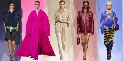
Each one resorts to a color to tell their story. Balenciaga uses black, often associated with sophistication, to show fashion as a story that takes place in the streets (where many wear black). Miu Miu reinforces with navy blue its allusion to collegiate aesthetics and its historic obsession with uniforms. Versace resorts to the pastel tones that everyone remembers from Gianni’s campaigns from the 1990s, and Saint Laurent uses beige to extend the influence of its safari jacket from the 1970s to any type of garment. But perhaps the greatest recent example is that of Gucci. The highly anticipated debut of Sabato de Sarno with the Italian house last September was announced on billboards throughout the main capitals of the world with one word: Ancora (which means “still” or “once again,” with all the connotations that might carry) over a dark red background. No image; just a concept and a color that was later seen on some garments during the show.
However, the most paradigmatic current case is that of Valentino, which last year presented an entire collection in a sort of fuchsia pink, a color created by Pantone expressly for the house and which they named Pink PP, alluding to its creative director, Pierpaolo Piccioli, who said that his unilateral commitment to that color was his way of responding with optimism and rebellion to some strange moments. Still, there was a sophisticated marketing strategy behind that choice: a long history of the founder of the house, Valentino Garavani, associated with red, that the house now wanted to repeat with fuchsia. The strategy ran its course, and more than half of the garments of the new Valentino collection for next spring are entirely white. Clean slate.
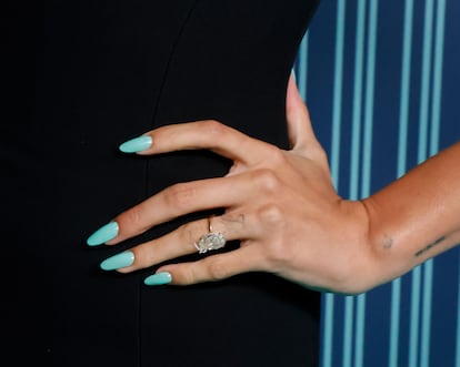
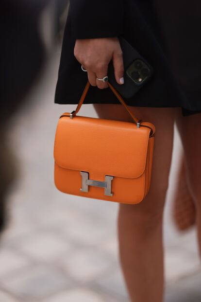
The cultural symbology of color and its psychological associations are very old, but its unconscious connotations in the minds of consumers only began to be exploited about a century ago, when theorists such as Faben Birren became consultants in the 1950s and advised firms like Dupont and General Motors on what colors to use to provoke emotions in the minds of potential clients. Of course, there are also some random alliances between brands and colors that ended up being lucrative: Hermès is orange because there were no cream-colored boxes after World War II, so they decided to make a temporary change with a batch of orange boxes that were “defective” and ended up becoming definitive; Tiffany & Co. is blue because at the end of the 19th century, when it was founded, upper-class brides wore a similar shade in their accessories on their wedding day; and Louboutin’s soles are red because in 1993 the designer wanted to debut with a shoe that paid tribute to Andy Warhol, and he felt that that combination was wearable and pop at the same time. The first two colors are trademarked, and Louboutin has been litigating for a decade so that no one else can use its style.
From Chanel’s black and white combination to Elsa Schiaparelli’s shocking pink or the aforementioned Valentino red, the history of fashion is full of brand and color associations. Today, however, it is not about the commercial talent of the designer to know which color provokes a specific emotion in the client, but about creating a marketing strategy that wins the battle on TikTok and Instagram, with their three-second stories, thirty-second videos and instant memes.
It has been a while since the luxury brands reduced their logos to a subtle and sophisticated typography, very similar to each other. That is why it is the color what unconsciously makes a difference, almost without us realizing it, unlike the literal and explicit nature of the monogram. Pantone acts as a consultant to explain to the brands what shades better convey the social moment and, therefore, the public’s expectations (in other words, what colors we are willing to wear) and some brands develop entire strategies to launch their own.
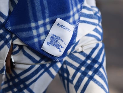
While the runways seem to imply that almost no one wants logos anymore and that everything is leaning towards subtlety, Instagram continues to be the battlefield for immediate distinction and recognition, and color is all that remains as an aspirational tool. Gucci is burgundy, Valentino is white, Burberry is blue, Miu Miu is navy blue and Off White is yellow — at least for now.
Sign up for our weekly newsletter to get more English-language news coverage from EL PAÍS USA Edition


