New York doesn’t love the new ‘We❤️NYC’ logo
Local residents have lambasted the mayor’s idea of reinventing the classic ‘I ❤️NY’ created by Milton Glaser in 1977. We asked graphic design experts why it’s so bad
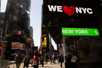
New Yorkers are very passionate when it comes to their city. There is nothing that motivates them more to rise up as one than when someone tries to modify one of their emblems. And when it comes to something as iconic, timeless and personal as the I ❤️ NY logo created by Milton Glaser in 1977, arguably the most recognizable and copied logo in the world, the reactions can be furious.
That’s what happened this week after Mayor Eric Adams and Governor Kathy Hochul unveiled their new campaign to reactivate tourism following the Covid pandemic, with a reimagining of the famous logo, now called We ❤️ NYC. “This is literally the worst design I’ve ever, ever seen,” said a user on Twitter, where the memes multiplied. “If there’s going to be a riot in NYC, it’ll be over this,” wrote another, in an ironic allusion to the rumors about potential unrest if former president Donald Trump gets indicted. “Don’t mess with perfection,” tweeted another alongside an image of the original logo.
It is not the first time that someone has attempted to update the classic logo. Glaser himself did it after the terrorist attacks of 9/11 against the World Trade Center, coming up with an I ❤️ NY more than ever. In August 2021, former Mayor Bill de Blasio’s City Council hosted We Love NYC: The Homecoming Concert, a musical in Central Park to say goodbye to the pandemic. Nobody complained then.

The feeling now is different. The city is in full post-traumatic liberation and nobody wants to hear about the “pessimism” over the future that the campaign is trying to counteract, according to the mayor. If Glaser created the logo to promote tourism at a time when the city was ravaged by debt and unemployment, NYC is now fully displaying its famous resilience, despite soaring rent and inflation.
Campaign officials have taken the criticism in stride. Creatives reacted quickly with a big ad on the screens in Times Square directed at their detractors. “We love critics, even if they don’t like our logo.”
“We are NOT replacing the classic logo,” designer Graham Clifford insisted in an interview with EL PAÍS. “We wanted to pay tribute to the old logo, and as you can imagine, it was a delicate balancing act.”
The choice of the new font that replaces Glazer’s typescript is inspired by the typography of the New York subway signs. The new heart abandons the flat style of the original to give it a new dimension in order to adapt to the idea of “using emojis as part of the graphic language,” he explained.
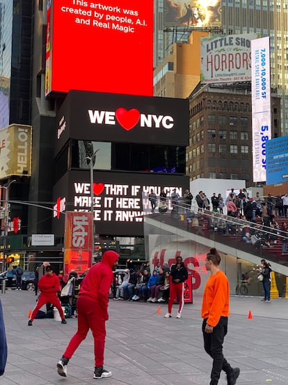
It is precisely this new aspect, which is adapted to social media, that grates experts. “I get the impression that it won’t last long, it’s like a TikTok in a branded version,” explains the Spanish graphic designer Pablo Delcan, who has lived in the city for more than 15 years and collaborates with The New York Times, New York Magazine and The New Yorker.
The digital version of the new logo gradually replaces the heart with emojis of local symbols such as a hot dog, the Empire State Building or a Yankees cap. “Milton’s survived the passage of time for being beautiful and iconic, not because of the campaign behind it, but because of the power of design itself”, adds Delcan, who recalls that in the 1970s designers were listened to more attentively, without the intervention of the great marketing machines that now surround graphic art.
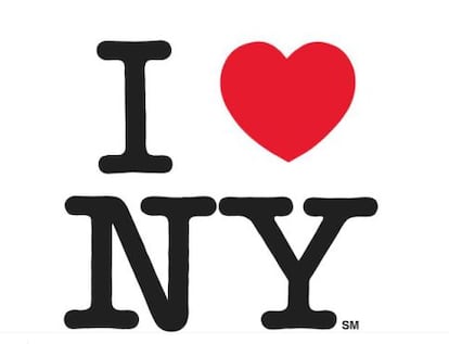
Steven Heller, a graphic designer for The New York Times for 30 years, as well as a critic and college professor, recalls how Glaser’s creation, sketched on a paper napkin in the back of a taxi, “moved” people by its ability to capture the aspirations of New Yorkers in “a way so rare and powerful” that even with countless copies existing it continues to have meaning.
Heller considers the new logo a “bad imitation” that lacks “the nuance and freshness” of the original, intoxicated by the tendency to adapt designs to the ephemeral digital environment. “The heart is more of a cliché emoji than something sincere,” he points out, after interpreting it as a raised fist signal against some threat, instead of a call to welcome. This 72-year-old native New Yorker — whose son is Nicolas Heller, better known as @newyorknico, for his Instagram account with more than 1 million followers where he supports small businesses and discovers the most curious characters of the city — sends a last message to its creators: “I wish them the best, but they should learn that a classic cannot be improved without losing the loyalty of those who are represented by it.”
Sign up for our weekly newsletter to get more English-language news coverage from EL PAÍS USA Edition
Tu suscripción se está usando en otro dispositivo
¿Quieres añadir otro usuario a tu suscripción?
Si continúas leyendo en este dispositivo, no se podrá leer en el otro.
FlechaTu suscripción se está usando en otro dispositivo y solo puedes acceder a EL PAÍS desde un dispositivo a la vez.
Si quieres compartir tu cuenta, cambia tu suscripción a la modalidad Premium, así podrás añadir otro usuario. Cada uno accederá con su propia cuenta de email, lo que os permitirá personalizar vuestra experiencia en EL PAÍS.
¿Tienes una suscripción de empresa? Accede aquí para contratar más cuentas.
En el caso de no saber quién está usando tu cuenta, te recomendamos cambiar tu contraseña aquí.
Si decides continuar compartiendo tu cuenta, este mensaje se mostrará en tu dispositivo y en el de la otra persona que está usando tu cuenta de forma indefinida, afectando a tu experiencia de lectura. Puedes consultar aquí los términos y condiciones de la suscripción digital.


