The stories behind the world’s most notorious colors
EL PAÍS looks at the origins of some of the most controversial pigments, from Vantablack, the blackest black in the world, to Pantone 448C, considered the ugliest hue in the world
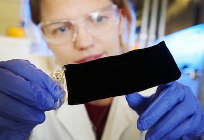
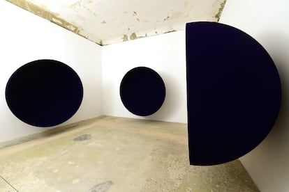
There is a color so similar to the mass of a black hole that it practically does not let light escape from it. Popularly known as the blackest black in the world, the rights to its use were bought in 2016, by British artist, Anish Kapoor. Dubbed Vantablack, the pigment was developed by the UK company NanoSystems, which specializes in nanotechnology and research. It is a substance created from carbon nanotubes capable of absorbing 99.9% of the visible light spectrum, so that when the light reaches the color, instead of reflecting it, it is trapped in the forest of small cages that retain it, to be subsequently expelled in the form of heat.
Vantablack requires a temperature of 752ºF (400ºC) to be created. It holds the world record for the darkest substance created by man. But it is a black not without controversy; having bought the rights to it, Kapoor is the only person in the world who can use it for creative purposes. The global artistic community is up in arms and has gone as far as to accuse him of a crime against art.
The controversy has also exacerbated the rivalry between Anish Kapoor and English painter Stuart Semple which has been ongoing since 2016. Angry after Kapoor’s purchase, Semple decided to create his own version of blacker-than-black in 2019, and, via a Kickstarter campaign, raised the full funding for its development in just 38 hours. Black 3.0 is a pigment that is technically similar, but only absorbs between 98% and 99% of light.
The origins of Semple and Kapoor’s rivalry date back to when Semple vetoed Kapoor’s purchase of one of his most famous inventions, the pinkest pink. On Semple’s website, there’s a disclaimer by which any buyer must confirm that he neither works for nor collaborates with Kapoor, and that the pinkest pink will never fall into Kapoor’s hands. Semple, by the way, is also the inventor of the purest cataloged white in the world, or White 2.0., which promises to be 50% brighter than any other white, reflecting 75% of the sun’s rays and almost forcing you into wearing sunglasses to look at it.
Blue, a cursed color but the darling of the fashion world
But the blackest black in the world is not the only controversial color. Prussian blue is one of the most important and prominent shades in the history of art. It was accidentally discovered by German chemist Heinrich Diesbach in 1704, and has been considered the first modern synthetic pigment. The writer Benjamin Labatut describes it in his novel A Terrible Greenery (2020) as “a blue so dazzling that Diesbach thought he had found the hsbd-iryt, the original color of the sky, the legendary blue with which the Egyptians decorated the skin of their gods.”
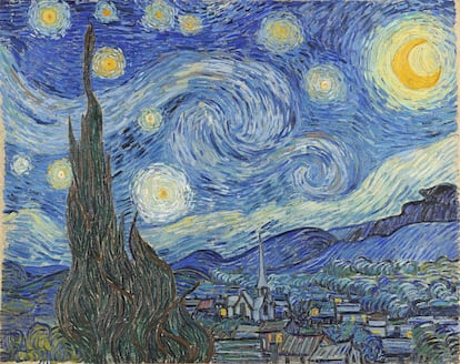
At first, it was used as a dye for the fabrics of military uniforms in Germany, so it is also known as berliner blau. And it soon became a reference for painters and artists during the 18th century, as it lowered the cost of the blue used until then, which was obtained with lapis lazuli (a metamorphic rock) and was one of the most expensive colors on the market. Works such as The Great Wave off Kanagawa by Katsushika Hokusai and The Starry Night by Vincent van Gogh use this pigment. Even in the 20th century, Pablo Picasso’s famous blue period has Prussian blue as its protagonist.
Surprisingly, one of the most interesting uses of this blue is in the medical field. Included in the World Health Organization (WHO) list of Essential Medicines, it is a very effective antidote to heavy metal and radiation poisoning. However, it also holds a macabre secret, as, when mixed with sulfuric acid, it becomes one of the most powerful poisons in the world: namely cyanide.
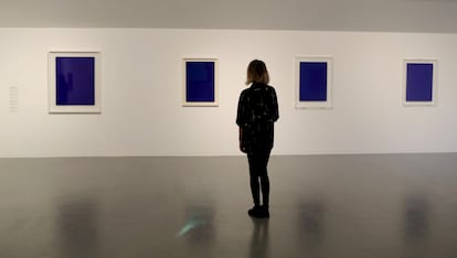
Medical catastrophes aside, there is a shade of blue that has colored much of the second half of the 20th century’s fashion and art. It is an intense, almost electric shade of blue that needs no introduction: Klein blue. The French painter Yves Klein registered International Klein Blue (IKB) in 1960, developed in collaboration with Edouard Adam, a Parisian paint supplier. The uniqueness of this color lies not in its pigment, but in the synthetic resin binder with which it is mixed and which allows its vibrant intensity to be maintained. Fascinated since childhood by the blue of the sky and the sea, Klein considered his IKB to be the most perfect possible expression of blue, his great masterpiece, capable of capturing the infinite. Coveted by visual artists and other brands around the world, it is also a forbidden blue, since its use requires permission from the painter’s widow and manager of his legacy, the artist Rotraut Klein-Moquay.
Copyrighted colors and the world’s ugliest
There are colors that have become the hallmark of a brand, such as Coca-Cola’s red or the orange of telecommunications company, Orange. Brands know the immense power of color association and, for this reason, many are exclusive owners of their most characteristic colors. Barbie pink is registered by Mattel and, in 2012, the company launched one of its dolls dressed in its Pantone 219C.
Meanwhile, the jewelry house Tiffany’s has the copyright on its turquoise blue, Pantone 1837C, also called Tiffany Blue, which uses that number in a nod to the year the company was founded. Designers have also known how to use color in their branding: think Christian Louboutin and his unmistakable red-tinted soles, which have inspired fetishism. He registered the shade in 2008, and, since then, has taken several copycat brands to court for infringement of rights and plagiarism in both Europe and Asia. So far, Louboutin has won, establishing himself as the only producer of crimson soles in the world.
But there is one color few are in a hurry to appropriate; one that has been called the ugliest color in the world. Seven different studies corroborate that Pantone 448C, a mix of dark brown with greenish gray, is the least appealing shade of all shades. In 2012, an agency hired by the Australian government invented the hue for use on cigarette packs to create an aversion to smoking. The GFK agency involved in the research confirmed its success, with participants claiming it was unattractive and dirty. Importantly, it put people off smoking. However, a small percentage described it as “elegant,” because, of course, there’s no accounting for taste.