All identical and none alike: Andy Warhol’s formula for instant fame is a hallmark of 20th-century media
The covers that Richard Bernstein drew for ‘Interview Magazine’ marked a way of understanding communication, style and celebrity in the 1970s. This June, an exhibition in New York honors him

It is a truth universally acknowledged that the pop culture fan in possession of the slightest notion of history must like Interview Magazine. The most legendary pop publication in the West was founded by Andy Warhol in New York in 1969, under the name Inter/View. It began as a fanzine in the strictest sense, focusing on friends of Andy Warhol, mostly filmmakers and artists. Warhol believed in fame (ephemeral) and repetition (eternal). His legend reflects that today.
By 1972, Warhol’s popularity had skyrocketed, to the point that Inter/View’s publishing company proposed opening the magazine to the general public and competing with giants such as Time, Newsweek and New York Magazine. It would be called Interview Magazine, to be made up of interviews with celebrities done by other celebrities. And, to enhance the Warhol brand, it was proposed that he do all the covers. In the end, however, he accepted everything except for this.
In his memoirs, Bob Colacello, editor of the magazine during its second stage, recalls his partner saying that “it would never come out right and I would go crazy.” An alternative option was agreed upon, very much in the vein of the artist: according to Colacello, the goal of each cover would be to have the overall effect of “an Andy Warhol portrait, autographed by Andy Warhol even though Andy’s hand had never touched the page.”
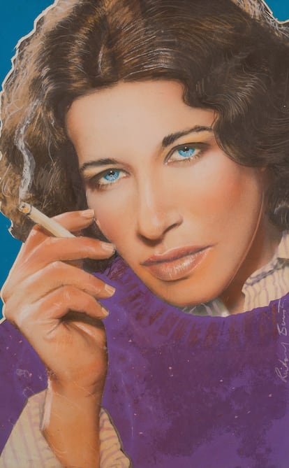
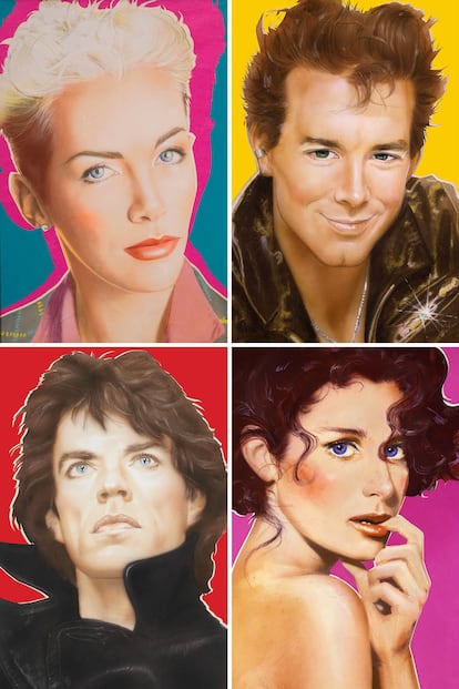
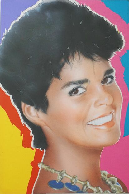
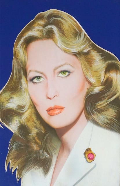
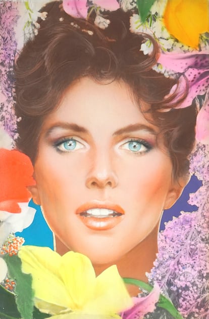
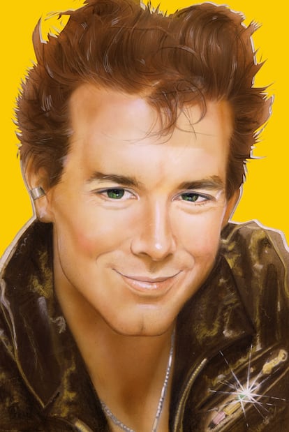
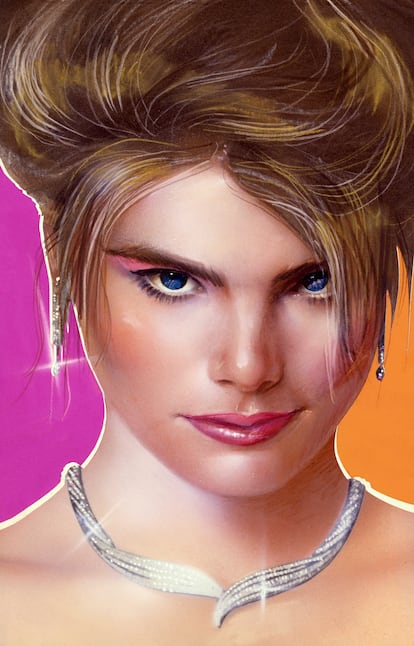
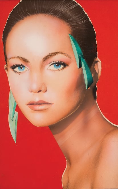
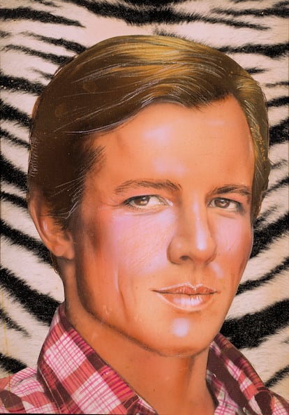
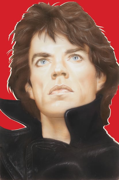
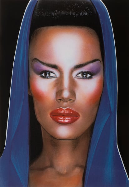
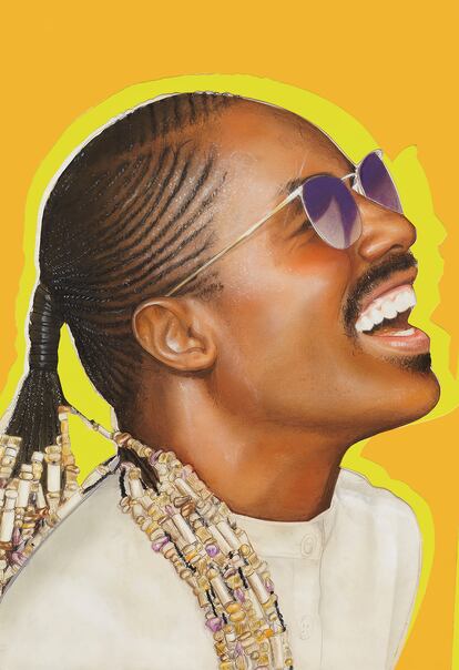
The mission fell to designer Richard Bernstein (1939-2002), a New Yorker who hraised between museums and the right nightclubs, like Max’s Kansas City. It was he who decided to reinvent the logo with more art deco letters, but as if drawn with lipstick. He also proposed hand-coloring the cover photographs, with a mixture of gouache, pencil, airbrushing and collages, very much in the style of Warhol’s lithographs. In short, he put together some of the most iconic prints of the 20th century press. Over the next 20 years, Bernstein would paint supernovas from the Warholian universe, including the likes of Cher, Faye Dunaway, Diana Ross, Fran Lebowitz, Grace Jones, Isabella Rossellini, Patti LuPone, Molly Ringwald and Mick Jagger.
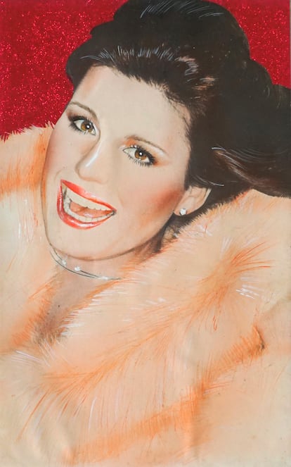

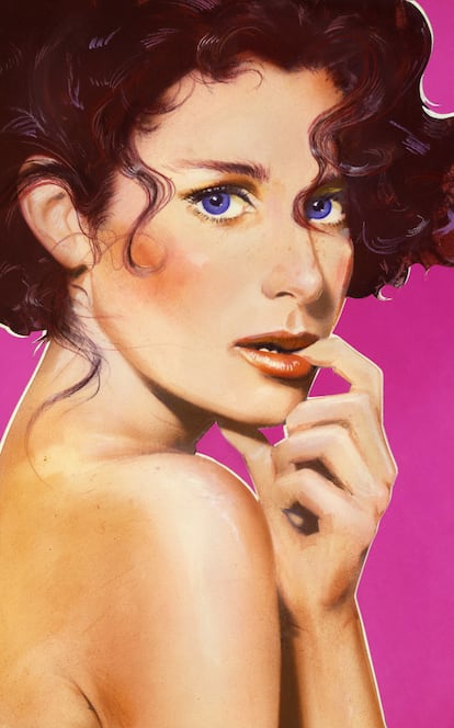
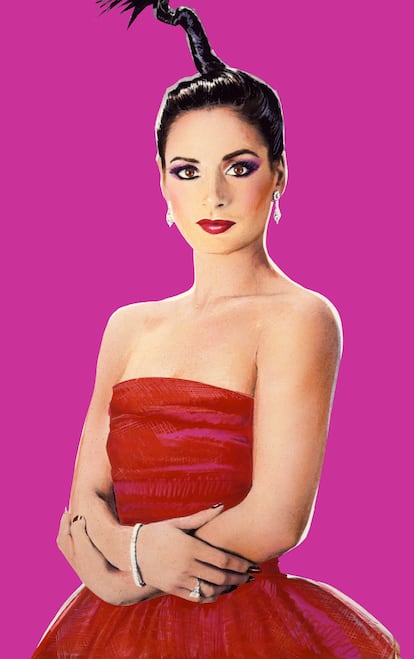
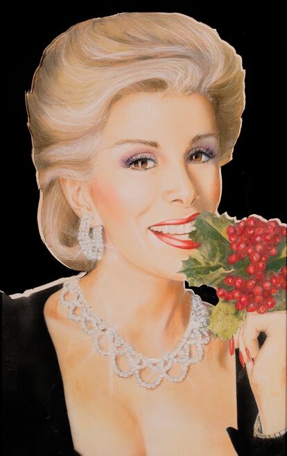

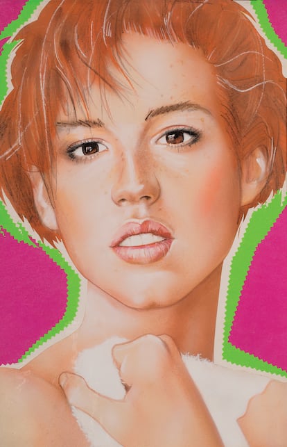
By September 1976, the formula had reached such refinement that the cover for that month, featuring Diana Ross, was the best-selling in the magazine’s history. Warhol never knew if it was because of the singer’s fame or because of the color combination that Bernstein used in the background (he used mostly hot pink, a color that was popular at the time. Following his repetitive logic, Warhol asked that Bernstein use “either blacks” [sic] or “hot pink backgrounds” for the next six months. Colacello refused.
Seen from the present, which can now be done in the exhibition dedicated to him at the NeueHouse Madison Square in New York City, until June 30, Bernstein’s work is archetypal of a way of understanding fame, communication and fashion. “Today these portraits reflect the confluence of art, fashion, celebrity culture, and graphic design that are truly iconic and each their own masterpiece,” says Rory Trifon, Bernstein’s nephew and the manager of his estate, in an interview with EL PAÍS. “It is incredible to think that to create each portrait Richard only had a couple of weeks which had to be reviewed and approved by Warhol,” he adds.
Every time Bernstein finished a cover, Warhol always asked him to embellish the protagonist more. His initial reactions included comments such as: “Can’t Richard retouch it more? Her nose looks too big. Tell Richard just take a scissor and cut the bump out and then airbrush over with a little brown to make it look straight.” Or: “Gee, now this is a great cover. It doesn’t even look like her. It’s sooooo glamourous.” Warhol knew that people liked to see their words reflected, but not so much their appearance. As he used to say: “The interviews can be fun, but the photos can’t.” Hence his attachment to Bernstein: “Richard makes everyone look so famous,” Warhol once quipped.
Today, questioning the success of Interview Magazine is absurd. Even in 2024, in the era of instant celebrity and the prevalence of social media, the magazine is going through a new golden age (how many can say the same?) under the unmatched direction of Mel Ottenberg. But questioning Interview’s success is what makes its virtues flourish. In 1976, New York Magazine accused Warhol of continuing to make a fanzine: “Friends writing about friends in articles that look like the ads,” the article scoffed, asking Warhol who he thought was going to read it? “Our friends. And whoever’s on the cover,” the founder replied.
Even back then, Interview Magazine was a bestseller and a much-sought space for advertisers. But Warhol was right: every reader was so flattered by the editor that they felt like his friend. That’s what making a magazine is all about.
Sign up for our weekly newsletter to get more English-language news coverage from EL PAÍS USA Edition