AC/DC wasn’t fair to the designer of the band’s multimillion-dollar logo
The group’s famous emblem was designed for a single album, but the band has continued to display it on t-shirts, keychains, posters and at concerts. ‘I’ve received many commissions after that job, so it’s paid off in its own way,’ says the creator
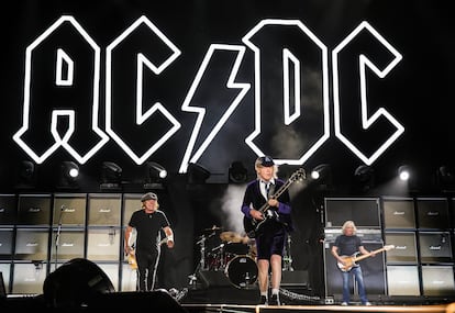
Gerard Huerta was fundamental in the history of AC/DC. Thanks to his work, the legendary rock group has amassed huge sums of money. However, the artist tells EL PAÍS that no member of the band has ever contacted him.
Huerta, 71, designed the group’s logo when he was just 25 years old: the intimidating four letters, split by a lightning bolt. The angular, Prussian typeface has since been used in dozens of brands as a synonym for toughness. According to a study commissioned by RushOrderTees, the most popular music-themed t-shirt of all time is the one that shows the logo that Huerta designed for the Australian band. Below it are names like Queen, Pink Floyd, The Beatles, Bob Marley… or the more current Ariana Grande.
It’s a very lucrative business, without a doubt. But the Los Angeles-born Huerta assures this newspaper that he has never gotten a cent for the thousands of products that were sold with his printed creation, be they key chains, baby clothes, adult underwear, mugs, toy guitars, jackets, or t-shirts.
To know the full story, we have to go back to 1977. “I’d been working for CBS Records for a while and had built a reputation with designs for albums by Ted Nugent or Blue Öyster Cult. Bob Defrin, the creative director of Atlantic Records (AC/DC’s label), followed my work and liked it. So, he hired me to design the group’s logo. When he asked me to do it, I was already established as a freelancer in an apartment in New York,” Huerta recalls, from his studio in Southport, Connecticut.
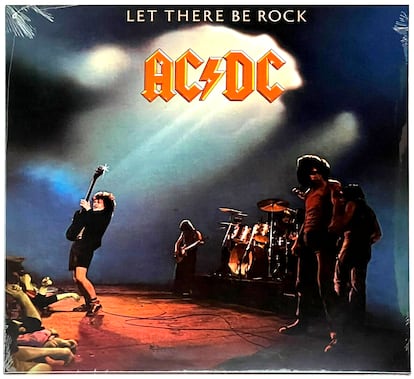
He explains the creation of the logo: “The shapes of the letters are inspired by the Gutenberg Bible, which is the first printed book. I then gave it a bevel and produced it in straight lines for a more blunt effect.” And those letters came out with a jagged and pointed perimeter. AC/DC’s first albums were released with a thin letter design and a slash in the center. It was in Let There Be Rock (1977), the fourth album by Angus Young’s band, that Huerta’s strong logo emerged. For the next album, Powerage (1978), it was changed to a design that was a mix of Huerta’s and what was on the first albums. “I guess it wasn’t that successful, so they put mine back on for the next albums,” the artist shrugs.
The agreement with Huerta was for a single album, Let There Be Rock, which was an important work in the band’s career, containing songs that they still have in their repertoire today, such as Whole Lotta Rosie, Dog Eat Dog, Hell Ain’t a Bad Place to Be, or the one that gives the album its title. However, the group decided (without consulting Huerta) to continue using the logo. Since 1979, only that one has been printed: Highway To Hell (1979), Back In Black (1980), For Those About To Rock (We Salute You) (1981)… all the way up until the latest one, Power Up (2020). Of the group’s 17 albums, 13 carry Huerta’s design. Nobody from AC/DC’s circle has denied Huerta’s version of events.
The California artist only received payment for the cover of the Let There Be Rock album, as he himself confirms to EL PAÍS. The designer handed in the work, forgot about it and moved on to other projects, including the design of the emblems for Time magazine and later for HBO and Calvin Klein Eternity. The contract also didn’t specify that the design for AC/DC could be printed on t-shirts and marketing products.
Huerta didn’t want to involve lawyers at the time. Today, his perspective is conciliatory. “They paid me a fair price back then and I’ve received many commissions for having produced that work. So it’s paid off, in its own way,” he notes. Asked how much he charged for the design, he responds: “I never talk about fees.”

In his book The Young: The Brothers Who Built AC/DC (2013), British writer and journalist Jesse Fink describes this episode: “For being a man who has contributed such an important element to AC/DC as a brand, and who could therefore be considered as someone who notably helped [the band] make a fortune with commercial promotion, you’d think Huerta would receive royalties, especially when the logo was designed for an album and not something AC/DC would use in perpetuity. But no, [he doesn’t].”
The designer points out the keys to a good logo: “It should be simple and adjusted to what the company or person represents. And this is very important: it must be well exposed. You can have the best design, but if no one sees it, it’s of little use.” Huerta is still active and working on assignments from large and small companies. “I like to think that I always do the best job I can for a client, as I believe you’re only as good as the last job you did. But I think the exposure of AC/DC’s work has probably given me a higher place in [the world of] design than I should have,” he explains modestly.
Although he doesn’t listen to the songs put out by Angus Young and company (“I prefer music from the 1960s and 1970s; I’m a big fan of The Wrecking Crew, a collective of musicians who played on many recordings from that era”), the artist is aware of what the Australian band is up to. AC/DC is currently on a European tour.
“Well, like all the bands from that era that are still playing, they’ve really become a cover band, since few of the original members remain. The same thing happens with Foreigner, The Rolling Stones, The Beach Boys... even The Eagles have only one original member left.” He pauses before clarifying that, in his opinion, “the result is still quite good, since the quality of the musicians who have replaced the originals is exceptional.” He’s a good guy, Gerard Huerta.
Sign up for our weekly newsletter to get more English-language news coverage from EL PAÍS USA Edition


