The problems Spain’s outdated data methods have caused during a 21st-century pandemic
The Spanish government has proved incapable of supplying clear and accurate figures about the coronavirus crisis, despite the need for such information to track and control the epidemic

/cloudfront-eu-central-1.images.arcpublishing.com/prisa/ELGRJG22RRESJHAENX7FMP2SMU.jpg)
On March 18, a Spanish man appeared on a database of people infected by the coronavirus: it was patient 217, a 22-year-old student who had been hospitalized in Singapore. Singapore was providing these and other details as part of their case-by-case data strategy, while in Spain, total numbers according to age had yet to be published. The story appeared in EL PAÍS and three days later, patient 217 himself contacted the newspaper via a social network: “Hello, I am the Spaniard who tested positive for the coronavirus on his return from Spain to Singapore,” he said.
The incident illustrates the disparities in the use of cutting-edge technology. The management of information in some Asian countries has been an example of modernity – for better or worse – while Spain and some of its neighbors are still languishing in the last century.
“The management of information and statistical data have been a big problem during this pandemic in Spain and in Europe,” says Helena Legido-Quigley, an expert in health services and associate professor at the London School of Hygiene and Tropical Medicine.
Clara Prats, a researcher in computational biology at Catalonia’s Polytechnic University (UPC), agrees. “All European countries have had to deal with similar problems, some more serious than others,” she says, adding that Spain lacked information systems that could cope. “They had to be corrected, validated and optimized as they went along.”
Meanwhile, Ángela Bernardo, a science journalist at Civio – an organization that promotes transparency in public entities – believes that “information management and communication has been revealed as a weakness,” and Saúl Ares, from the Spanish National Research Council’s (CSIC) National Biotechnology Centre, says “it has been a disaster.”
One obvious lesson that can be drawn from this crisis is that the capacity to manage medical data must be improved for the sake of transparency but, above all, because having organized and detailed data helps fight epidemics.
Why does data matter?
Epidemiologists don’t even know where to start when asked about the importance of the data. “The quantitative is inherent in epidemiology,” explains Miquel Porta, researcher and professor of Public Health at the Hospital del Mar Institute in Barcelona. Epidemiology emerged as a discipline after the 19th-century English physician, John Snow, used maps and statistics to prove that cholera outbreaks were caused by contaminated water. “Epidemiologists are the original data scientists,” says Miguel Hernán, professor of Epidemiology at Harvard.
The significance of data was highlighted in February this year when the figures coming in from China triggered concern among experts. “The epidemiological elite started talking about the possibility of a pandemic at the beginning of the month,” says Hernán. “By February 25, there was already a certain consensus among them.”
It was the data on the rate of infection, the lethality of the virus, the infectious capacity of people who were asymptomatic, the number of exported cases and signs of transmission outside of Wuhan that led to this conclusion.
On February 14, Harvard epidemiologist Marc Lipsitch was interviewed several times, stating that a global pandemic was likely. “They were telling us in January that there was a 50% chance, then at the beginning of February – 70%, and at the end of that month – 99%,” Hernán explains. “It is a new highly contagious pathogen, which can spread rapidly and should be considered capable of causing a huge social, economic and health impact anywhere. It is not SARS and it is not flu.”
As early as March, the figures suggested a consistently dismal outlook. The Johns Hopkins University website was anticipating which problems would emerge country by country, and those states where cases were flagged up subsequently saw massive outbreaks. Since then, the data has proved vital in pinpointing potential outbreaks, tracking contacts and locating clusters. It is data that has provided the information needed to allow us to protect ourselves. For example, we know to avoid poorly ventilated, enclosed spaces because a number of countries have collected the necessary data, investigating one office desk by desk.
Below is a review of the problems experienced in Spain in terms of data management, many of which are shared with other countries.
1. Collapse of detection and control systems
Early detection failed in February in Spain. The problem was due to the limited scope of the detection protocol. Until February 25, the only people allowed to be tested for Covid-19 were those coming from Wuhan. That made it impossible to detect local infections that were already on the rise. By the end of the month, when this protocol was relaxed, people testing positive surfaced so fast that epidemiological surveillance systems were overwhelmed.
The clearest example of this is SiVies, the National Center for Epidemiology’s (CNE) computer platform, which received information on each individual case from each autonomous region, including the patient’s age, place of residence, symptoms, and so on. This system was seen to be far from adequate. On March 9, only 140 cases out of almost 1,000 known cases in Spain (14%) had been reported and on March 16, only 700 out of 10,000 cases had found their way onto the database (8%).
Public health services in the regions were passing on data very late. At the end of March, according to information from fact-checking and verification website Maldita.es, three regions had failed to notify SiVies of even 20% of their known cases (Galicia, the Basque Country and Catalonia) and one of the hardest-hit regions had not yet reported a single case (Castilla-La Mancha).

The services that were supposed to monitor and control the epidemic were overwhelmed. They lacked qualified personnel, and were also technologically outdated. “The public health service is terrible when it comes to IT systems,” says Miquel Porta. “They are completely disparate, weak and often incompatible. The ministry does not exercise the necessary leadership in epidemiological surveillance systems.”
Hernán believes this is the main reason why so many European countries have been slow to react compared to Asian countries: “They already had both the public health infrastructure and public awareness there to defend themselves against the virus,” he says.
Another task that depended on the public health system was contact tracing. But if they didn’t even have the time to record cases in SiVies, how were they going to locate and interview the people connected to those cases? They needed an army, one that still hasn’t arrived – “One technician for every 3,000 people,” explains Legido-Quigley. That would mean 15,000 trackers working across Spain, which, according to the ministry, now has just 1,554 people doing the job. Then there’s the information systems. “There has been a huge effort to collect the data,” says Legido-Quigley. “But it is complicated with 17 autonomous regions and with the scant investment that has been devoted to developing monitoring systems over the years.” Experts highlight the effort made by public health professionals, but Hernán’s conclusion seems to be widespread among them – that the consolidation of systems capable of dealing with the task at hand will require greater investment in terms of both money and personnel.
2. A health service without a database
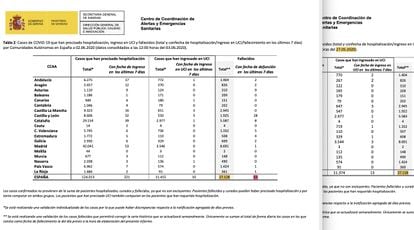
The Coordination Centre for Health Alerts and Emergencies (CCAES), led by Fernando Simón, has centralized the data provided by the Health Ministry on infections, hospitalizations, intensive care unit (ICU) admissions and deaths. But for months its management has appeared amateurish. Every day, figures from each region were recorded and summarized in a daily report – a handful of sheets of paper – in a PDF.
The system was set up on the fly. Existing information systems were not integrated, and on March 15, the ministry requested that the regions report their data between 8 and 9pm, using a dozen general indicators.
The request was rectified a month later in a bid for clarification. For weeks, the data on hospitalized and ICU patients had been added up differently, depending on the region. Madrid, Catalonia, Castilla-La Mancha and Galicia reported the people admitted daily, while the rest gave the total admissions to date. The confusion was not detected until April 2 and was not corrected until the end of that month.
These problems were acknowledged by Science Minister Pedro Duque, in an interview with EL PAÍS on April 23. “We didn’t have a roadmap for the pandemic,” he said. “Now we know; what we have to do is get a lot more people to collect data and compile it centrally. The data generated in a hospital goes first to a [local] department, then to the central government. These data have been slow in reaching us.”
The information received and disclosed by the CCAES gave an overview of all the cases in a region. It was not until May 12 that the ministry requested individualized information. Since then, it has required public health departments to report details on a case-by-case basis through SiViEs, “to facilitate early detection.” It is not clear when this information began to be channeled to the Health Ministry, but it started to be published at the end of May after the problematic transition.

3. A black week for official data
The change to individual data was potentially positive, but the transition has been a disaster and not even the Health Ministry has been able to adapt. Its “Covid-19 Situation” panel stopped updating on May 21 and didn’t start again until June 10. Meanwhile, figures of the hospitalized and deceased have not yet been recovered.
The hiatus has left many researchers without a clear picture. “We stopped publishing the daily report on the regions during those weeks,” explains Clara Prats. “We are also being affected by the freezing of the series of Covid-19 deaths, since we cannot carry out any analysis of real case estimates.”
Similarly, Susanna Manrubia, a researcher at the National Centre for Biotechnology (CSIC), says: “The data arrived late, and then we discovered that they were also unreliable. The change in criteria over the last month and a half, and the disappearance of around 2,000 deaths, is the tip of the iceberg.”
The other major setback came with data on the deceased. For weeks, the daily report has disclosed an inaccurate toll. On May 27, there was a column called “total deaths” but it was not the real total. A footnote explained that only cases whose date of death was recorded as the previous day were added up daily. This did not make sense as deaths take several days to be recorded. Consequently, the real figure was being permanently underestimated. A death that took place the day before yesterday and was known today would not be added to the total. Fernando Simón himself confirmed this was the case.
EL PAÍS wrote several reports about the confusion. Shortly afterwards, The Financial Times dedicated an article to Spain’s “flawed data,” and finally the problems became widely recognized. The week of May 27 to June 3, for example, the “total” increased by only 10 deaths, although the same report said that the ministry was aware of 63 deaths in the last seven days.
The unreliable “total” has resulted in chaos. Around June 3, there were days when no deaths were recorded, although the weekly figure still showed at least five or six a day and we now know that there were at least 20. It was a mistake to call something “total” that was not. And it was misleading to only record the deaths from the day before, if 90% of deaths take longer to make their way through the system. Fernando Simón acknowledged these problems, but the confusion was evident and even the prime minister, Pedro Sánchez, ended up claiming a zero death toll when it wasn’t so.
The debate has escalated, despite the fact that the truth is obvious: the government has not hidden the number of deaths, but neither has there been clear communication. It is not a case of the government hiding the figures because, if we know that there are more than 40,000 or 50,000 deaths recorded on the civil registers, it is precisely because that information is now published by the National Statistics Institute (INE). At the same time, the figures have clearly been contradictory. Firstly, because the wrong total was published during two weeks of a tricky transition. Secondly, because the official figure of confirmed deaths from Covid-19 was frozen at around 27,000 for more than three weeks. And thirdly, because the daily report could have provided more data to avoid clouding the issue. It is true that confirmed deaths are a standard measure used by many countries, but there was nothing to stop the ministry’s reports from also publishing the deaths being recorded over and above those figures.
4. Which data guided decisions?
There are a number of key data on which decisions have been based and which have not been modified. For example, during the confinement, infections continued to occur, but their whereabouts were unclear. A more effective system would have targeted specific neighborhoods and residences, as in New Zealand, where outbreaks were reported in an old people's home in Auckland and a wedding in Bluff. Only a few regions in Spain provided this kind of detailed information.
There are also doubts concerning the information on which the de-escalation is based. The April 28 strategy announced that the move from one phase to another would be based on objective criteria and public indicators according to province. A comprehensive list of indicators was drawn up which were to be ticked off “in an automated, daily and individualized manner.” But the list was never published. Some of these indicators were among those requested by the ministry from the public health departments on May 12, but they have only been partially published, and only since the end of May, which is after the May 8 and May 15 phase changes were decided.
Another unknown has been the extent and success of tracking in each autonomous region. It was supposed to be fundamental to preventing outbreaks, but no information was published until the start of June; the number of trackers was unknown as was the number of contacts identified as infected or positive. Figures on tracking were published only after June 5, without any breakdown by region.
5. Unclear data, even for scientists
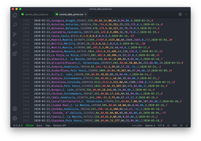
The Health Ministry has offered very little clear data on the coronavirus. There are some exceptions, such as a number of series published in CSV format through the Carlos III Health Institute (ISCIII), but these have been rare and irregularly updated as the focus of communication has been on the PDF reports.
The difference between the CSV and the PDF may seem like a technicality, but the CSV is accepted good practice everywhere. Transparency requires communicating data in a systematic way and in formats that can be reused and scrutinized. Without this, analysis becomes complicated, as Saúl Ares, a researcher at the CSIC, explains. “It is not only about the changes in criteria or the series that are discontinued,” he says. “It is about the fact that, until now, after fishing around to find some slightly less common piece of data, you finally get to the PDF. Tables on a PDF! I guess some people will not realize how ridiculous this is.”
Several organizations have asked for other data without success, such as the number of tests that were done in March. “For many weeks, the numbers of diagnostic tests carried out were not reported, even though this indicator is crucial to knowing how the epidemic is being managed,” says Ángela Bernardo.
Even today, we do not know how many people are being tested and what percentage are positive – information that is being provided by countries such as Italy and the United States. In many places, there has been a lack of usable formats, although it is easy to find better practices on official websites in Iceland, Norway, Italy, the United Kingdom and some of Spain’s regions.
Perhaps most seriously, access to the data is being restricted even among scientists. “From the beginning, we requested information according to municipality and age from the Carlos III Institute,” explains Manrubia. “We were told this was being reviewed and would soon be made public. But it hasn’t been yet. The lack of transparency in the data sounded like something was being hidden.”
Meanwhile, Diego Ramiro, from the CSIC’s Institute of Economics, Geography and Demography describes a similar experience after having requested data from the Carlos III Institute without success: “They were not able to respond due to a lack of personnel,” he says, adding that there is a price to pay for the barriers preventing access to information being experienced by the academics. “We will likely have new outbreaks, as happened with the 1889 and 1918 flus; it would be convenient to analyze the behavior of Covid-19 before that happens,” he says.
Conclusions
IT systems failed
National information systems have proven to be inadequate. The CNE is trying to generate information for public health decision-making, but there have been long delays in data reaching them at key moments. The CCAES, whose function is to coordinate information management in health emergencies, has not always received the data automatically and it took months for it to request individualized information.
There has been a lack of public health resources. The health services in each region have been quickly overwhelmed in the realms of monitoring and control tasks. There is a lack of personnel, especially in contact tracing, and the personnel there is may have had to fill in the gaps in the information systems manually.
There may be a lack of professionals with quantitative profiles, such as data specialists. A culture of transparency is also needed. Some of the problems with management cannot be blamed on a lack of resources – publishing a CSV is as easy as publishing a PDF.
Recommendations
Bringing the data into the 21st century
Possibly what is needed is research – to conceptualize the ideal management of this crisis and then try to work out what prevented that from happening.
Experts offer clues. “It is time to define protocols and facilitate their implementation,” says researcher Saúl Ares. “When faced with an epidemic, data collection must be exhaustive and transmitted to the authorities quickly and reliably; and it must be published immediately, transparently, centrally and in formats that allow for rational technological treatment.”
The creation of new entities has also been suggested. Epidemiologist Miquel Porta believes that “there has to be a state-run public health agency, which works on systemic problems.” From the CSIC, Diego Ramiro suggests that a specialized agency similar to the INE should be set up for health statistics – “Focused on generating them and not on research, which would speed up the availability of data,” he says.
Finally, it is worth asking whether the famous “data offices” – departments within the administration employing experts who know how to collect, analyze and disclose data – would have helped. For years, it has been said that data is the 21st century’s equivalent to gold, but we almost always think of the companies that exploit it. We forget that public institutions can make use of data to improve people’s lives. Fighting a pandemic is a case in point.
English version by Heather Galloway.
/cloudfront-eu-central-1.images.arcpublishing.com/prisa/QRGJD3EYTNGC7IPDA2HB3632F4.jpg)
/cloudfront-eu-central-1.images.arcpublishing.com/prisa/RP2LS43QJ5AGTGCXD5IT53MXF4.aspx)