What makes a movie poster great? Spanish designer behind Oscar hits shares his secrets
Pablo Matilla has been working in Los Angeles for nearly 20 years, creating memorable artwork for films such as ‘Dunkirk’, ‘Interstellar’ and ‘1917’

The legendary line “and the Oscar goes to...” has never preceded the name of a movie poster art designer, and there is no indication that the Academy of Motion Pictures Arts and Sciences has any short-term plan to award prizes in this category.
But Pablo Matilla, who has won other industry accolades including Clio Entertainment awards, considered the Oscars of film publicity, recently shared with EL PAÍS the secrets behind a good Hollywood movie poster.
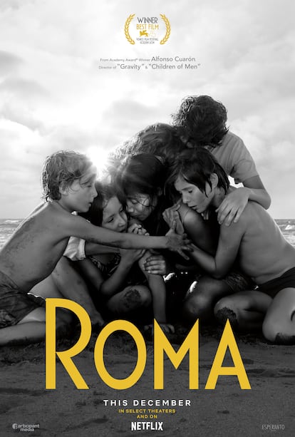
Born in the western Spanish region of Extremadura and raised in Seville, the 40-year-old designer has been making posters for the Hollywood film industry for the better part of two decades. An associate creative director at Concept Arts studio in Los Angeles, he was the mind behind the poster art for hits such as Dunkirk, Interstellar, 1917 and Roma, which means that he has worked with leading directors including Christopher Nolan, Sam Mendes and Alfonso Cuarón.
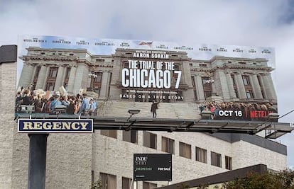
Matilla has developed the promotional images for many movies that have gone on to the Academy Awards, most recently The Trial of the Chicago 7, which was nominated for six Oscars.
Matilla says that the posters he has made for Oscar contenders do not necessarily share any traits. However, “I think that most of them have sincere graphics that try to remain faithful to the director and the team’s artistic vision. They are a sample of the movie’s tone and genre,” he notes.
The designer speaks enthusiastically about his work, and is happy to be able to put his imagination at the service of interesting projects, no matter what their size. Creating poster art in the US film industry – and increasingly in Spain as well – involves a large number of professionals and complex processes, including many trial-and-error cycles that make an art form out of rejection management, something that should probably be taught at design schools.
But Matilla himself never studied graphic art. Instead he studied filmmaking at schools in Barcelona, Los Angeles and New York. As a poster art designer, he feels that his work mostly involves interpreting the director’s vision. “Obviously, you are free to focus on scenes from the movie that you find the most interesting and representative, but ultimately it’s the director who will decide if you accurately translated his vision in one brushstroke,” he explains. “The best movie directors have a clear vision of their movie from the first scene to the last advertising element. Not all of them decide to get that involved in the process, but those who do want the poster to remain faithful to the movie, to the story it tells and to the tone of the artistic proposal.”
According to Matilla, the key to designing a good movie poster lies in finding the balance between art and publicity. “When they show too much advertising information, they lose visual impact. On the other hand, there are some very aesthetic posters that don’t attract anybody to a movie theater because they are not a window into the film’s narrative. That’s why it’s so important to strike a balance.”
“If you’ll notice, both Dunkirk and 1917 have some things in common. The color range in both is modern. The soldiers are not wearing helmets, they are not shooting or pointing their weapons at anybody; their body language is vulnerable. All of this humanizes the characters and creates feelings of empathy in the viewer. Although both fall under the war movie category, they label themselves as anti-war and this is reflected in the posters,” he explains.
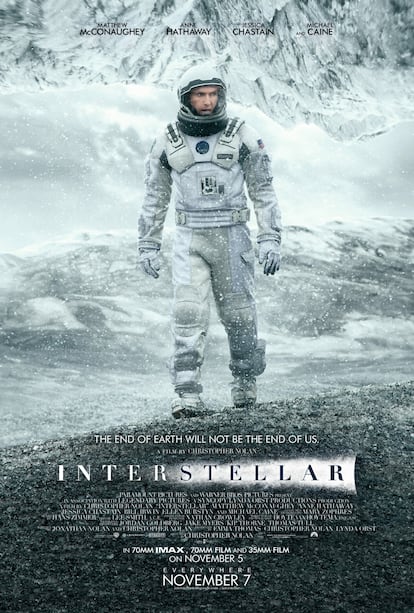
And then there was the Hollywood hit Interstellar. For this kind of movie, studios make many different posters instead of trying to cram everything into a single image. “If you analyze the poster art prior to my own that was made for this movie, each one highlights different virtues: the space trip, the lead character’s emotional connection with his daughter, the sense of group adventure.”
The payoff, or final poster designed by Matilla, shows the main character’s vulnerability in a hostile environment, without providing too many details about the story other than the fact that he is wearing a NASA spacesuit. There is not even a spaceship in sight. And even though it stars a famous actor, his presence is not unduly exaggerated. “I think that this is where the movie studios are really brilliant in their marketing strategy: they are able to identify the main audience and provide the basic information to attract it,” says Matilla. “In the posters for Dunkirk and for Interstellar, the most important information is the director, Christopher Nolan, so we avoided unnecessary distractions. In cases such as Kong: Skull Island, you have a spectacular cast and a good director, but the main message for the audience is that this is a movie by the producers of Godzilla.”

Matilla says that studios can test out posters the same way that they test the movies themselves, but that at the end of the day, “the best indicator that the poster is the right one is whether the director likes it.”
“There are people out there with a lot more talent than me,” he claims. “I’m just lucky to be in the right place at the right time to work on these movies. It is not false humility, it’s the truth.”
There are hardly any awards for movie poster art in Spain, but the Premios Feroz, considered the Spanish answer to the Golden Globes, do have a specific category for Best Poster. Matilla does not believe that this is going to happen in Hollywood any time soon: “I see the opposite trend: I think that TV networks favor award ceremonies with fewer categories and more attention on the stars. We have other forums such as the Clio Entertainment Awards or the Golden Trailer Awards, although I miss the Key Art Awards, which used to judge posters by movie genre and by specialized professionals.”
English version by Susana Urra.